Rafiq, age 8
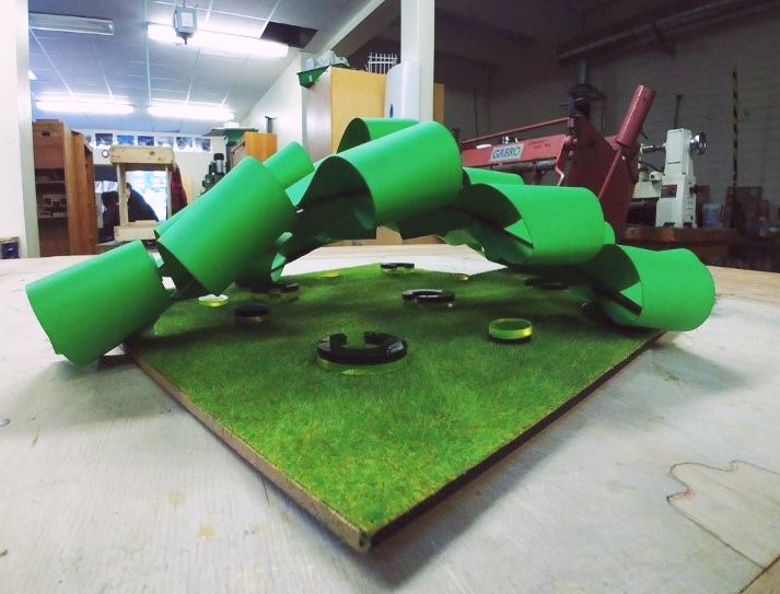
This design has been inspired by the well-connected local community and gives homage to the variety of natural areas and environments Streatham has.
The vines are arched across each other. Allows more natural light to penetrate the inside of the pavilion and disperse across a wide range whilst winds are not impacting the users. The spacing of the vines and spacing of each individual vine were increased in comparison to the former prototypes. This was done to allow the people who are sitting inside the structure to have access to more natural light and have less dependence on unnatural light which health studies have proven that unnatural light is bad for health and can be bad for eyesight. Natural light is reflected of the natural theme I’m incorporating into this design. Natural light has proven to have additional health benefits.
I initially decided to adopt a triangular holding structure to hold these the leaves in place instead of a straw based structure where beams were under all three leaves. However, with the card material, it was better to instead adopt a free-standing structure. This structure allowed for more space to be optimised and allowed for a more open space to be incorporated.
In this final model, I have improved on the mobility and usage of my pavilion compared to the prototypes.
Seating and social areas have been implemented across the area of the pavilion to allow people to make better space of the area. I have used circular seating areas which promote human interaction and social interaction. This was inspired by my European Parliament social space case study, which experimented with different social interaction methods in terms of seating.
CHOSEN LOCATION: STREATHAM HIGH ROAD BROWNFIELD SITE
This area has many features that make it stand out for reasons it should be made into a pavilion. This derelict piece of unused land for years has a nice wide shape to allow for a pavilion to be built. Also it addresses the problems that the area has, such as how unattractive the unused piece of land is, the area is very public so it can fit the criteria required for a public space an if built can be another alternative place for people to use and enjoy. Because the land isn’t public owned, residential views and concerns don’t necessarily apply here. This allows us to be more creative in a pavilion designing process. This area is a pedestrian hub, people pass this area to go to the local Sainsbury’s supermarket to do shopping, workers use the nearby bus stop to commute to and from work. Children pass this site to go to school. A community of people living in the local housing complexes use this area to move around their area. The sick and elderly use this area to get to the local medical practice. This just proves how extensively used this area is and how visually and atmospherically hostile to the people who use this environment and how building a pavilion will make the community a more positive place to be in.


